ShopDreamUp AI ArtDreamUp
Deviation Actions


Suggested Deviants


Suggested Collections


You Might Like…


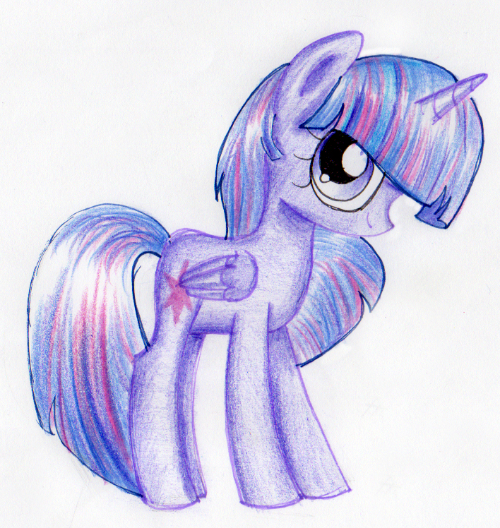
Description
I'll be doing Christmas gifts for some of you guys this month! This one's for StrawBerryCupcakes7!
Image size
708x748px 764.13 KB
© 2016 - 2024 SongbirdSerenade
Comments30
Join the community to add your comment. Already a deviant? Log In
The hair looks awesome. Great job with the shines, especially with the forelock. You did a great job with the bashful stance, and the eye makes it look really cute! The biggest issue is how you did your linework; at some points(like the top of the rump, the bottoms of her hooves, and on the wing), you can clearly see two lines. It would help to clean that up a bit. I have a few suggestions. I think you should try using a black pen for the linework, and with that, make the lines thinner or thicker depending on the brightness of that area. That will make the picture look more dynamic. You can make the line thicker on the under belly, the bottoms of her hooves, either the front or back of the legs(depending on the direction the light is coming from), the bottom of the head/hairline, and the backside of wherever the light comes from(Like if the light is on the right side, make the line thicker on the leftmost parts of the drawing). That's just a suggestion, though. If you want to continue drawing like this, it still looks good. I'd love to see you try it, though. Going along with that idea, you should make it clear which way the light is facing. You should also be more careful of keeping the color within the lines, just to keep it looking as professional as possible. For help with blending, use a white colored pencil, just to make the colors more solid overall. You did a great job with the overall position and proportions, and the shading looks awesome. I can clearly see your improvement from your older drawings, so keep up the good work!